Minimising risk to safety for veterinary staff
Role
In 2023, I was a UX designer at Covetrus. I helped improve the user experience of Ascend, their cloud-based veterinarian practice management system, based on customer feedback. I worked with a product manager, a senior UX designer and front-end engineers to meet the needs of veterinary staff surrounding patient alerts.
Problem

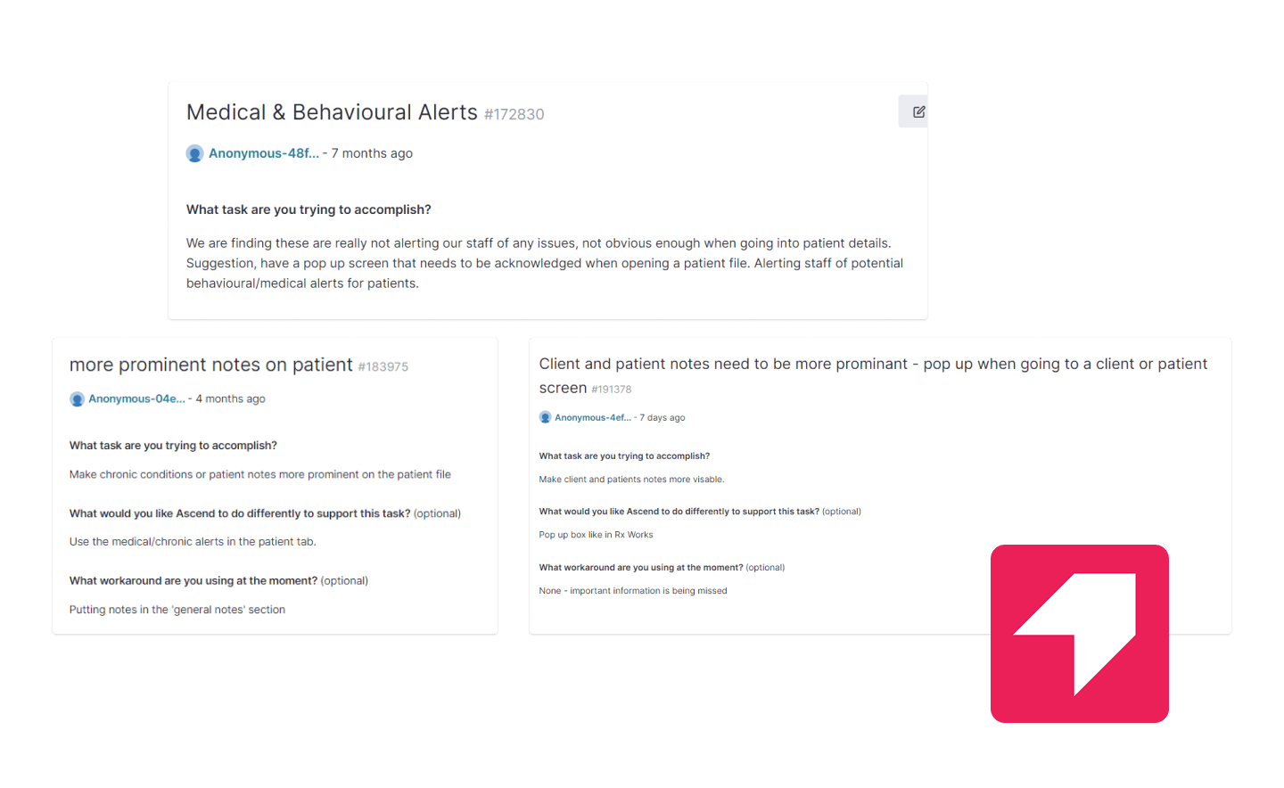
Multiple users expressed that medical and behavioral alerts on the practice management system were not obvious enough and their staff were unfortunately getting hurt in the process. Understandably so, these requests received the second most amount of votes on Pendo by other users.
Research

The Pendo feedback from customers gave us a possible solution but did not provide much details into what's going on. To dig deeper into why and how these alerts were being missed, I visited 2 clinics and interviewed 2 other vet nurses remotely to understand their frustrations and needs around patient alerts.
The workflow

From the clinic visits, I determined the points in a typical client visit where patient information needed to be salient. Initially, I focused on the appointments only (yellow dots). Later, we expanded the scope when a customer accidentally booked two patients with behavioural issues in to arrive at the same time.
Veterinarians are busy people
When it comes to testing, it’s typically recommended to aim for 5-6 participants per user group but veterinary staff are busy people with demands of a clinic to manage. 11 users voted for pop-ups on Pendo so I made a Loom video to share some ideas and ask for an interview. No one viewed my video unfortunately so this tactic didn't quite work. If you have any little tidbit on what to do instead, I’d love to know!
Tons of information at a glance

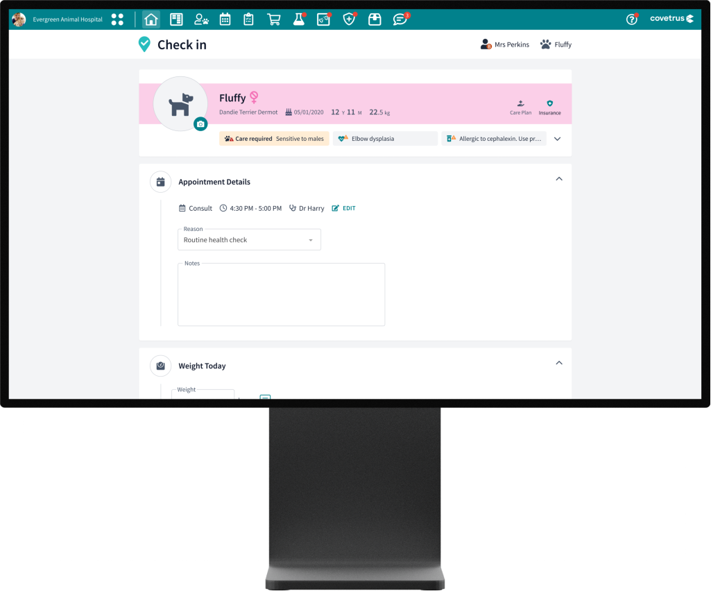
Through jamming and design critiques, the Senior UX Designer, and I landed on an idea that delivered a ton of detail in a compact form.
One key insight from user interviews was that the notes attached to the patient's behaviour status were crucial in providing more context. For example, a dog which "requires care" may only be sensitive to other dogs and unaffected by people This was a fun UI challenge to figure out. How might we include the extra details from notes in the high-level patient's bio?
Outcome
The final designs were made with great collaboration with customers and they tested well internally, especially among Covetrus team members with veterinary experience
To further validate the effectiveness of this solution, I could've run a task analysis study and tested: (A) admitting a new patient with a behavioural issue and (B) booking in a new patient with the new designs.
To find opportunities for improvement, I'd collect data on how often the new patient alert section was expanded to validate the decision on what the default state of the patient notes section (expanded or minimised) should be. And how often people were clicking expand section, scrolling down to notes and editting a note as that may reveal another UX opportunity.